Difference between revisions of "Visual Identity"
From MEDS Wiki
m |
|||
| Line 40: | Line 40: | ||
the edge of a document, poster, etc., another layout element... | the edge of a document, poster, etc., another layout element... | ||
<br> | <br> | ||
| − | [[File:Grid 1.png| | + | [[File:Grid 1.png | 500px]] |
| − | [[File:Grid 2.png| | + | [[File:Grid 2.png | 500px]] |
Square in the “m” and use this shape to keep the distance, rotate to 90 degrees like in the picture. '''Do it with all LOGOTYPES A, B and C''' | Square in the “m” and use this shape to keep the distance, rotate to 90 degrees like in the picture. '''Do it with all LOGOTYPES A, B and C''' | ||
Revision as of 21:10, 30 October 2019
MEDS_visual identity guidelines
This article is to teach you how to properly use MEDS logo.
Made on May 17th 2019 by Jennifer Beitel and Marta Badurina.
This is the decision made by MEDIA department during the discussions after MENC Ohrid, MENC Zaragoza and MENC Galway.
Last logo redesign: MENC Ohrid 2016 by Mariano Eckert, Marta Badurina and Jennifer Beitel.
Initiatives logo design: April 2019 by Ana Čajić. Tjaša Čordaš, Steven Whitehouse, Marta Badurina, Jennifer Beitel.
Tables of contents:
1. VERSIONS OF OUR LOGO
2. WHERE TO FIND IT
3.HOW AND WHEN TO USE IT
4. INITIATIVES LOGO
1.1 IMPORTANT FOR LAYOUTING
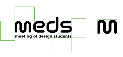
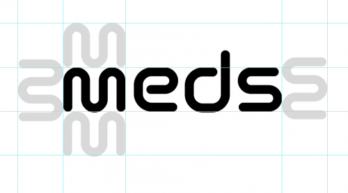
The “m” of the logo can help you to keep the right distance from the logo to
the edge of a document, poster, etc., another layout element...


Square in the “m” and use this shape to keep the distance, rotate to 90 degrees like in the picture. Do it with all LOGOTYPES A, B and C
1.2_WHERE CAN I FIND THE LOGO?
MEGA > MEDS NETWORK > MEDIA > CORPORATE IDENTITY > LOGOTYPE https://mega.nz/fm/cIVUnbiJ
find the login details on slack!
BEFORE WE START:
The Font that we use for ALL TEXTS is called: MONTSERRAT
You can find it here to download: https://fonts.google.com/specimen/Montserrat
It is easy to use for any device and is also easy to use in Wordpress on the website!
2_HOW TO USE THE LOGO AND WHEN
PRINT
2.1_PRINT_small scale
(documents, visa letters, anything when logo is used as a disclaimer and it’s in a small scale max. 1-2 cm in height)
materials to work with https://mega.nz/fm/ZBlRnRbC
This is when we use LOGO A. If you try to use logo with a subtitle (LOGO B) - it’s not going to be readable.
2.2_PRINT_big scale
(posters - from A3 to banners)
- materials to work with https://mega.nz/fm/ZBlRnRbC
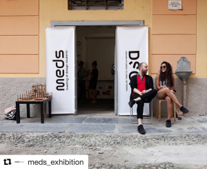
If the logo is alone, we use LOGO B (photo example underneath)


